Tuesday, 28 February 2012

Overall evaluation of my contents page

target audience:
while making my contents page, i had to have my target audince in mind, as everything i did to it was determined by my target audience and the qualities that would be expected of them to be interested in:


tickets:

while making my contents page, i decided to include an overt advert; and by doing this, i would include an image to help promote the event.
so i decided to include a computer generated image of a ticket to help advertice a concert. by of course i couldnt use the image; as i did not take it by myself, so i decided to make the image much more suited to my music genre.
Tickets
View more PowerPoint from wownoway


layout:
Layout
View more PowerPoint from wownoway


colours:
Colours
View more PowerPoint from wownoway

slogans used:

Audience reserch for music magazine.

Thursday, 2 February 2012

Reserch on music magazines

Music magazine research:

I have chosen to make a fuck music magazine: I have chosen this genre of music as it enables me to open up my ideas and also allows me to be very creative. With funk music I am able to do learn new things as its genre/type is very different to other music genres
funk music: Funk is a very distinct style of music based on R&B that reached its height in popularity from the mid 1960s to late 1970s. . The word funk being transformed from the original one of a pungent odour to a re-defined meaning of a strong, distinctive groove. One of the most distinctive features of funk music is the role of the bass guitar


Target Audience:
Due to the fact that the genre of music that i have choosen; funk, which originated in the mid 1960's, my target audience would have to be older ages.
while I was reserching the fashion and styles of the 1960 it began to make sense of why funk originated at that time and age.
Due to this, my target audince would have to be the ages from 25 and above.


Attributes of funk music: mood board:

1st magazine analysation:

Layout: all of the cover lines have been placed on the right hand side of the magazine, which is not normally done in magazines (normally, the image is placed in the middle of the magazine). The masthead seems to also not follow the conventions of an ordinary magazine, it is being covered by the artist’s hair, this might have been done to connote how huge or popular the artist is.  The name of the artist is also very bold and properly laid out. I have also noticed that the artist’s name is the same colour as the name of the magazine.

Cover lines: this magazine includes very little amount of cover lines. But in red it refers to (again) the featured artist “the diva and her demons Amy Winehouse” this magazine also makes references to concerts and “tours “the police the white stripes, the velvet revolver Dave Matthews”  this  informs the readers that Dave Matthews would be performing but does not actually say it: this almost acts as a teaser.

Colour schemes:  rolling stone magazine uses three colours to promote itself. These colours are light blue, black and red. These three colours are very easy to spot, which works in their favour. Although these colours are very attractive, they have been structured in an orderly way; the main title has been coloured in blue while the subheading as been coloured in red, which immediately draws the audience in.

Main image: in this magazine (rolling stone) the main image (Amy Winehouse) has been placed on the right hand side of the magazine cover, which could have been done to connote that she is on the right hand side of her career; which makes her very popular. In this image, she seems to be overpowering the magazine; I say this because she seems to be taking up most of the space, and covered the mast head with her hair. Here, rolling stone magazine doesn’t seem to be following the conventions of a magazine cover.  I have also noticed that the celebrity on this magazine seems to be posing and looking at the readers: which is very conventional to when making a music magazine; it creates a synthetic personality with the audience.


Mask head: “rolling stone” has been written in Monotype Corsiva font. This is very fancy but yet still makes a statement. Parts of the mask head is covered by Amy Winehouse’s hair, which could have been done to show how proud and honoured the company may be to have her on the front cover their magazine. The mask head is also coloured in blue similar to the colour Amy Winehouse’s name is. Again to emphasis on how honoured they may be to have her on their cover.

2nd magazine analysation:


Layout:  Again, just like the rolling stone Magazine, vibe magazine also lays the main image on top of the mast image. This could have also been done for the same reason; to honour and show how proud they are to have the artist on their front cover.  Most of the cove lines have been laid on the right hand side of the magazine, unlike the other two which have been laid on the top of the magazine and on the right hand side. The cover line on the top of the magazine has been laid on the top for an immediate effect; the readers read the cover line at the top before anything else. 

Colour scheme: there are about five different colours been used on vibe magazine, although they are not exactly bright colours they are almost very stereotypical to the male character, I say this because colours such as black, blue, yellow on black are normally associated with the male gender and not the female because of the impact the have on the gender. I have also noticed that the words coloured yellow, black and blue seem to be the “the must reads” as they are very appealing as well as eye catchy.

Main image: the main image on this magazine features usher: a musician, in this image the celebrity sticks out his middle finger which is offensive but due to the type of magazine this is, this is not recognised as offensive, I say this because vibe magazine is about being different, this also works hand in hand with the cover lines on the magazine, as most of the words used would not be used if the character looked cute and innocent. Again, in this image the celebrity looks at the readers, but this time he’s got glasses on, which as well as creating synthetic personalisation, puts a little twist on it.

Mast head: again, the mast head is covered with the main image (celebrity) which could have also been done to show that this is not like any regular magazine as it does not seem to abide with magazine codes and conventions.  The mast head is coloured blue, which is the same colour as the important cove lines on the magazine, I say this because words such as “sex”, “Ashanti” “you” have also been coloured the same as the mast head. The font wide Latin has been used, this is due to the boldness and the way it stands out.


Friday, 20 January 2012

Making of my music magazine: Reserch and Planning.

Before I started making my magazine front page, I had to make sure I had a visual example of what m finishes product may look like. So I decided to make a draft copy.

Rough Draft of my magazine:


My music magazine planning:
Would your chosen font deplete the genre?

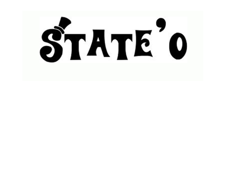
The image on the left, is the font I would like to use for my mask head, this is so it could stand out, and be different, this font is called willy wonka.
I choosen willy wonka because it has got this squirky side to it, which is an attribute of funk.
I carried out a reserch on some funky fonts which could suit my music genre; funk, and came across this website. Although I did not get my choosen font from this website, it helped with ideas and it came in handy as a reserch.
Here's a link to funky fonts:

What is the name of your magazine?
Due to my music genre, i decised to choose a name which is as wild as my music genre; funk. although i did not want to make my mast head too obvious, I wanted it to be related to the genre. having said all this, i had some rough ideas of what names i wanted for my magazine, i came up with ideas such as: THIS IS FUNK, Funkadelic Groove, Funk Sensation, State'O Mind/ State of mind, FUNK YOU. All these ideas were brain storms which then lead to me being stuck between; THIS IS FUNK and "State'O Mind" although i really liked "THIS IS FUNK" as it makes a bold statement, i still did not want to be too direct with my mast head, So i choose "State'O Mind" as the name of  my magazine, i choose it because it does not give too much away, but at the same time relates to my music genre.
What is your magazine about?
My funk magazine is basically all about everything funk. By saying this i mean, it ranges from music to funk gossips. my magazine is being made to revive the 1960 feeling back. in the 1960, there was alot of vibrant colours, conventions were broken, bright colours were used on stuff like hair and even fashion. Funk allowed and enabled people to be themselves without being judged and so would my magazine; State'O Mind. State'O Mind would include funk gossips about past funk artists and band, which have seemed to have faded over the past years. my magazinve would also include free prizes which is normally used to artract audiences as it persuades them to buy the item. my magazine would also include the latest funk tracks and artists, this would help keep my target audieneces alert about funk music.

Describe the design of the title: layout, colours, and font’s placement land size:
Layout:
     Due to my image, i have chosen to lay my coverlines on the left side of the page, this is to enable the message that the image carries gets accross to my primary and secondary audince without being lost or perhaps misunderstood.

Fonts:
    My two main fonts are Times New Roman and Gill San Ultra Bold Condense; I have chosen these two fonts to make sure that I dont overcrowd my front page, like i did with my student magazine. To make sure that my magazine took on codes and conventions of any other magazines, I would have to make sure that there is a variety of font sizes.


What would be dominate image be?
my main image would include my potencial target audeince holding or playing an iconic funk instrument. this is being done to still keep the stereotypic funk attributes alive. my main image may also include someone with an afro hair, with vibrant colours.
What does the image tell your potential audience?
Due to my main image, my target audience would be stereotyped as wild individual, they may then be regared as outgoing people; which is what funk is about. Having said this, i do not want to indirectly stereotype my target audience in a nagative way, or indirectly limit my target audience. So to avoid this; i would have to include (maybe) a varity of potential funk audience, i say maybe because in the 1960's funk was stereotypicaly made for the black population, and was a way for them to release any emotion or anger they had within them.
Would your target audience find your front image appealing? And why?
I think my target audience would find my main image/front image appealing, i say this because it follows the conventions funk music rather than the conventions of an ordinary magazine. To keep my target audience conected to the image i would have to create synthetic personality between the audience and the image. This means that my main image would have to include a perosn (whether male or female) to look directly at the camera; target audience. which makes them them feel "special".
Would you be including any other image on your front cover? If yes, what would they be?
I would be including other images on my front page, this is to make it unconventional and make it different, this is (again) due to my choosen music genre, as it does not follow conventions, it forms its own. I would also be including images of of festival to keep the "Funkadelic groove" alive. This is also de to the fact that one of my coverlines would be about a summer festival, the image would help to create a visual aspect to the coverline, it creates an image in the viewers head; that the festival would be fun.
What articles would be found in your magazine?
My magazine would include articles relateing to upcoming funk artists, funk legends, celebritries who have turned a new leaf and even drugs. These topics all relate to funk in some way, for instance, drugs; alot of funk artists ( Parliament Funkadelic ) have used drugs, which has seemed to damage them in some way, this also relates to the topic: celebrities who have turned a new leaf. 
     I have choosen to use articles like this  in my magazine because, to me, thats what funk is bout, "State'O Mind", this includes everyday thoughts, as a whole.  This includes the good times which is the creation of funk- which allowed enominous amount of people to express themselves, the bad times- the downfall of funk, and some of its artists and legends.  
How does these articles relate to the title?
           Again, i  have choosen these topics because to me, thats what funk is about. "State'O Mind" it relates to the emotions of the people. Topics which deal with people's everyday lifes, it is a good way to relate to my title, as it links with my title: "State'O Mind". by writing an article which could be hart felt and easy to relate to; my target audience would a sense of warmth. Articles titles such as "Bring back the days of nappy wear and ol school rythm... Parliment funkadelic are in the building!" could be a really good article as it could be refered to as heart felt time, which was when the parliment funkadelic split (which was a sorrowful time- according to fans) in essence, an article which, again, refers to the dept of funk, would be a good way to attract a primary and secondary audience 


How many different colours are you using? What colour, what size and what font?
The colours being used on my music magazine are very vibrant and bold, they make statements. I have choosen to to use more than two colours, I have choosen to use three, this is because funk is all about not following conventions, although funk realates to alot of colours, i would only be using three, to keep it simple and less crowded unlike my student magazine, which due to fonts and colours used, my magazine looked crowded and untidy.
Fonts: I would be using only two fonts, again this is to try to keep the magazine simple and tidy, although funk is unconventional, I would have to follow some conventions to enable my magazine to be recognised as a proper magazine. the fonts i would be using are:  New Romans and Bernared CS. this is because these two fonts are very simple but yet are still bold, which is also used on the posters located below.

Would your target audience find this appealing?
I would peronally say yes. This is because my magazine is a funk magazine, its theme is unconventional and different. so, the different fonts and different colours are just steps towards a professional funk magazine.

An deal funk poster which shows the conventions of funk:


This poster shows the different techniques which are used to attract a funk audiences. Colours such as green, orange, yellow, red and black have been used, I have also noticed that these colours are dark colours rather than bright colours; which i would be using on my magazine. I have choosn to use bright colours due to the fact that it was all about the bright colours in the 60's, and this was what attracted audiences at the time, so i am presuming that these are the same thing my audiences would be appealed to.

Another ideal funk poster:
I can see that these two poster are funk posters, but follow two different conventions, I have noticed that this poster includes bright colours which could be described as "funky", while the other magazine is also unconventional, but achieves this using dark colours.
         So, in essence what i am trying to say is that, although i  may be using bright colours, i can still make it unconventional through my layout.

I have also noticed that colours such as yellow, green and black are typical funk colours, i know this as i have carried out reswerches which have shown me this.




Thursday, 8 December 2011

evaluation of my student magazine.

                                                   student magazine evaluation
My magazine does not challenge conventions, but rather copies some, as most magazines follow the same ideas. in my magazine, my mast head is quite bold and big to ensure that the audience are able to recognise it from every other magazine. My coverlines have been placed on the left hand side of my magazine. I have done this due to the fact i wanted my image to be placed on the right hand side,i have done this to avoid following every conventions of making a magazine, as the image should have been placed in the middle of the page.


My magazine refers to my target audience as hardworking individuals but at the same time presents them as very outgoing indviduals and young. I say this because my coverlines.
 "300 n 1 ways to strive for your goals", "lyric compititon! a chance to win a singing lesson with beyonce!"
All of my coverlines are educational but then, make sure that they are interactive to make sure that the target audince do not get bored and can always interact with it.

My audience are teens from the age of 16 to 19. I have choosen this age group because they are in college, and  my magazine is for college students.

I would like my magazine to be sold at music venues and festivals, this is because my magazine includes alot of refrences to musicians
("A chance to meet Tinie Tempah", "Win a trip to Barcelona to meet Beyonce for a singing lesson"
 My magazine would also be sold at colleges, i think,  this is a really good way to sell my product as the students would be able to get one at anytime they want to. I could also sell my student magazine in supermarkets, this is because alot of people (students) go to supermarkets so advertising it where they are would be really good.

I have attracted my target audience with my coverlines, they include names of celebrities which my target audience look up to: names such as Beyonce and Tinie Tempah are icons to my target audience.
I have also attracted my target audience with the colours; colours such as light brown, black and white, these colours are not stereotyped which seemed to work in my favour.
I have been made to learn how to use indesign which i have alsways avoided because i have always found it complicated, but being exposed to it, has enabled me to be able to use a program much more advanced than photoshop. I have learnt that when using indesigm, i had to excercise pacience, i say this because i am still learning how to use the program, which would take time.

I would have to take pacience into making my music magazine, i say this because now i would not be making a magazine for my age group but rather a magazine for a specific group of people.
I would also have to take into acount the colours, ethnicity and even a diverse age group which would suit my target audience. I would also have to learn new techniques when using indesgn, this is to enable my magazine to look much more professional.
I would also have to do much more reserch so i can be able to get my finished product looking professional; By doing more reserch on colours, layout, techniques, images and even magazine conventions i would be taking my magazine to another level.

analysation of magazine front cover:

Mask head: “cover line” quite catchy and sends the idea of being insured by education. The mask head below is large this has been done so it could be immediately spotted from the other magazines. It has also been outlined in black; again to make it look very bold and stands out.


Colour scheme: My two main colours are light brown and white: this is because they both complement each other in a sense that they are not harsh and are not immediately stereotyped to an audience as my magazine is for both male and female. I also chose these colours beceause theya re both not harsh and too strong.


Main image: my main image features a young college student reading. This immediately informs the readers that the magazine is for students. The image is of a young female, although this may send an idea that the magazine is for females. It includes cover lines that are stereotypically for both genders.


Background: the mis en scene iasically a black chair; I have used props such as a pen and a book I have done this to emphasis on my magazine name and subheading, which is education.
Selling line: “the only insurance for your student life” this connects with both the magazine name and target audience, I say this because it identifies exactly what the magazine has ben made for“Cover line” “the only insurance for your student life” this shows that college students should be surrounded by their education, as it is their “insurance” for the future.
Fonts: for my selling line I have used: Segoe script. I have used this font as it takes on a student like character; it also tends to look very ordinary but yet makes a statement. My two main fonts are wide Latin and Bernard MT condensed; these two fonts have been used to emphasis on my simple look, to make a statement but yet not be so flashy, so it dose not overwhelm the page. 
Layout: Most of my cover lines have been placed on the left hand side of my magazine; this has been done to be enable to be identified immediately. I do have one cover line which stands on its own, on the right hand side of my magazine “Exclusive, Get tips for your future” this cover line stands on its own so it is seen immediately. 


anotation of magazine front cover:


Analysation of content page:
My content page takes up the same colour scheme as my magazine front cover, this is to ensure that the audince are still aware of the magazine they are reading.
i have also done this to make a signature for my magazine so whenever my target audince see my colour schmem they auomaticatlly know its coverline magazine.
I have placed the coverlines which i think my target audince are going to mostly appealed to on my content page, I have done for an easy access to where my readers want to read.
coverlines such as "A chance to meet Tinie Tempah in a lyric compition!", " Win a trip to Barcelona for a singing lesson with Beyonce" these are coverlines which  know my target audience would be mostly appealed to, I also included additional information just to make sure that my readers know exactly what they are going to be reading
For example in my front cover: "A chance to meet tinie tempah!
while in my content page: "A chance to meet tinie tempah in a lyric conpition!


anotation of magazine content page.